John Snow: Having data is not enough
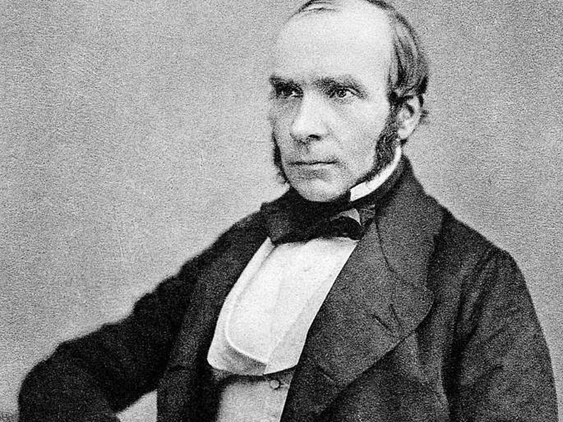
It is necessary to understand their relationships
A Map Changed the Cure. 1854, London
Between the end of August and the first days of September, in the Soho district, more than 500 people died after contracting cholera, in the space of just a few days. It was a very difficult time for London, but all the deaths were nevertheless recorded, including not only the personal details of the victims but also where they lived.
London therefore did not have a data problem. It had a problem with the way in which that data was interpreted.
The information available at the time on the transmission of cholera led people to correlate the spread of the disease in very confined areas and its virulence with the consequent attribution of contagion to miasmas (that is, the exhalations produced by unhealthy air and decomposition).
I
t was an interpretation consistent with London at the time: in those years, the city was overcrowded, without a sewage system adequate for the growth of the population. The result? A foul-smelling city; wastewater flowed along the streets – even the busiest ones – and ended up contaminating wells and waterways, producing an unhealthy and easily perceptible smell that immediately suggested a disease whose causative agent had not yet been identified. An explanation that matched what people saw: questioning it was difficult.
Difficult for everyone, but not for John Snow, who had already done so in 1849, when he published the first edition of On the Mode of Communication of Cholera, arguing that the disease was transmitted through the ingestion of contaminated water. He could not have known that science would prove him right many years later, when Vibrio cholerae, the famous comma-shaped bacterium responsible for cholera, would be isolated and recognized. Yet, even then, he had noticed that the miasma theory could not explain the behavior of the epidemic. If the problem had simply been the air, people living on the same streets and breathing the same exhalations should have become ill in a similar way.
Except that – in reality – the cases followed different distributions.
When cholera struck Soho in 1854, Snow did not start from a sudden intuition, but rather from a hypothesis he had been trying to verify for years and from a specific question: what were the elements that the people who had fallen ill had in common?
He consulted the death records, went to the victims’ homes, spoke with their families and reconstructed their habits: by cross-referencing the information, he thus realized that almost all those who had died lived near the public pump on Broad Street. And that those who lived farther away habitually drank its water. Some preferred it to the water from pumps closer to them; some children drank it on their way to school: therefore, even the cases that appeared incompatible with his theory, rather than being excluded (as noise), were examined one by one. Snow was not only looking for confirmation, but for a legitimate explanation capable of accounting for the anomalies as well.
He also carried out a countercheck, working on “what had not happened”: as in the case of the nearby Broad Street brewery, where there were no recorded deaths among the workers.
This could in some way have called Snow’s theory into question, except that it was discovered that these workers had their own water source while at work and mainly drank beer (produced with boiled water); similarly, in the case of the workhouse (the poorhouse) on Poland Street: despite the presence of hundreds of people in a confined space, there were few deaths compared with the rest of the district. Therefore, if air had been the main cause, this would have been difficult to explain, whereas the explanation lay in the fact that the building used an independent well.
This is where the map comes into play.
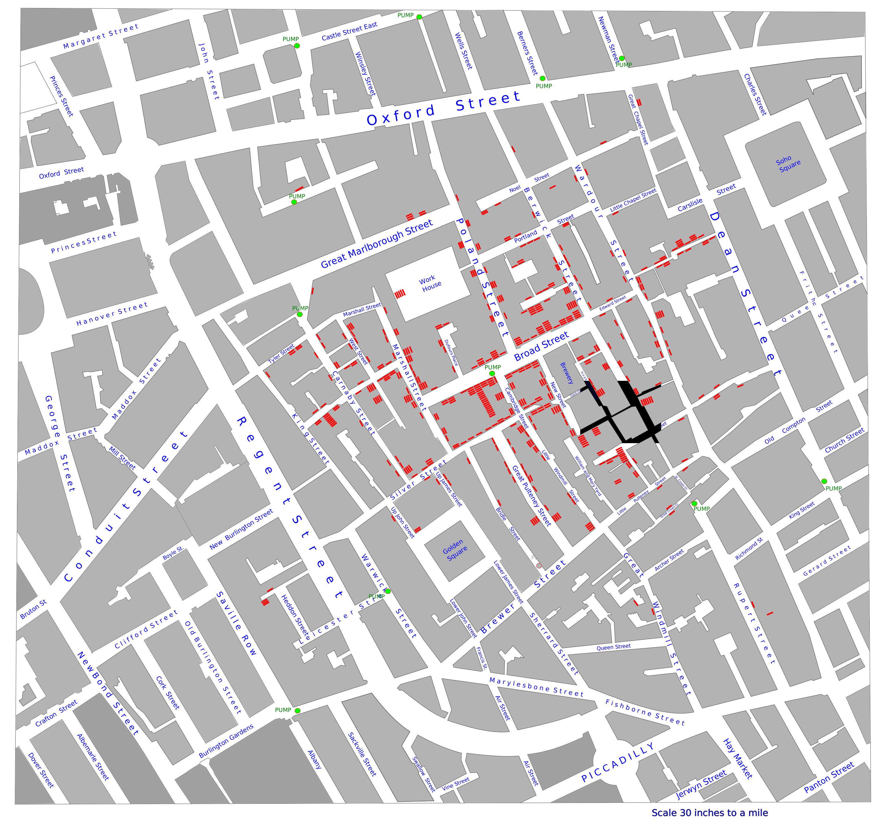
In the representation published in 1855, each death was indicated by a small black line placed at the building where it had occurred; when several people had died at the same address, the lines were drawn next to one another. The result showed an evident concentration around the Broad Street pump and a progressive decrease in cases as the distance increased, especially beyond the areas where it was more convenient to use another pump.
The map did not provide Snow with new information; it allowed him to see, in a few seconds, a relationship that until then had required pages of records, addresses and testimonies.
He therefore had an indisputable insight: he changed the way in which the available information could be understood.
This is an important distinction, because the most widespread account turns John Snow into the man who drew a few points on a map, identified the Broad Street pump and put an end to the epidemic. The reality was much more complex and, precisely for this reason, more interesting.
When the pump handle was removed – on September 8 – the number of new cases was already decreasing, also because many residents had fled the district, and Snow himself acknowledged that it was impossible to establish how much that closure had affected the immediate course of the epidemic (the discovery of Vibrio cholerae would definitively prove him right only years later).
But we must consider two elements: the closure of the pump remains a fundamental action, but not because it represents a simple and definitive solution; rather, it represents the moment when a sufficiently solid interpretation becomes an operational decision, even though uncertainty has not been eliminated.
The second element is the map, which proved decisive, not because it contained more data, but because it showed the relationships between that data. The map transformed a sequence of separately recorded deaths into a phenomenon that could be observed as a whole, and made visible a pattern that the dominant model could not explain.
Almost two centuries later, the problem Snow faced is surprisingly close to the one we encounter in cybersecurity.
An infrastructure can be monitored in every one of its components and still remain difficult to understand as a whole. This happens because the visibility of individual elements does not coincide with knowledge of the relationships that connect them: an anomalous access, a variation in traffic, a change to a configuration or the unexpected behavior of a device may be interpreted as low-impact or independent events, but when they are placed within the same context, they can reveal lateral movement, an ongoing compromise or an attack moving across different environments.
The point is not (only) to collect information, but to build a representation that gives meaning to what is collected;
It is a method that should be familiar to those working in cybersecurity:
An alert acquires value only when we know which asset it concerns, what function that asset performs, which other systems it communicates with and what consequences its compromise may produce; without these relationships, even a large amount of information remains a collection without a map.
There is then a second point: John Snow did not limit himself to reading the data; he accepted that it could contradict the explanation considered correct by the majority.
In cybersecurity, this step is still difficult: too many organizations observe events through models built on already known threats, documented architectures and behaviors considered normal and, when reality deviates from that model, the risk is that the difference will often be treated as an irrelevant anomaly, rather than asking whether it is the model that no longer correctly represents the infrastructure.
The story of John Snow therefore does not only tell us about the value of data visualization: it tells us about the value of a representation capable of calling into question what we think we know.
Today we possess far more data than Snow had available, infinitely more sophisticated tools for collecting it and technologies capable of analyzing it in times that would have been unimaginable then, but this does not guarantee that we will be better prepared to understand it.
It is another way of defining and pursuing resilience. Gyala’s Agger automated cyber resilience solution is based on these principles and follows this modus operandi.
Sources:
https://www.gutenberg.org/files/72894/72894-h/72894-h.htm
https://www.thelancet.com/journals/lancet/article/PIIS0140-6736(00)02442-9/abstract

